Dashboard Update

Trends Of Racial Disparities In Covid-19 Outcomes In US Cities

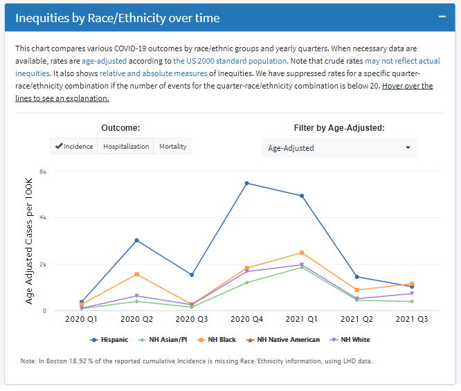
The COVID-19 Health Inequities in Cities dashboard was created to compare and track inequities related to the COVID-19 pandemic across a multitude of dimensions, including across subgroups of individuals within cities, across neighborhoods within cities, and across cities. The newest addition to the dashboard focuses on describing and comparing inequities by race/ethnicity in COVID-19 outcomes over the course of the pandemic. City specific trends of racial disparities over time Within the “City Report: Inequities: Outcomes” tab, users can select a city of interest and examine trends in COVID-19 outcomes over time for different race/ethnicity sub-populations.

Continue reading

Dashboard Update: Vaccination Outcomes by Age

The COVID-19 Health Inequities in Cities dashboard allows users to characterize and track COVID-19 outcomes and inequities in COVID-19 outcomes over time across multiple levels: across subgroups of individuals within cities, across neighborhoods within cities, and across cities. The dashboard has recently been updated to include two new features that leverage data on COVID-19 vaccination outcomes by age. The first new feature shows city-specific inequities by age group and can be found under the City Report: Vaccination Inequities section of the dashboard.

Continue reading

Tracking Inequities in COVID-19 Vaccination across Large US Cities

We recently developed a new dashboard section for tracking outcomes and inequities in COVID-19 vaccination. This section allows users to track, describe, and compare inequities in COVID-19 vaccination on multiple levels in 29 large US cities. City Report: Vaccination First, in the City Report Vaccination tab, users can select a city, explore, and visualize inequities in COVID-19 vaccination outcomes by race/ethnicity and by neighborhood.

Continue reading

Testing Site Metrics: Potential Community Demand

This analysis and metric were inspired by the work of Kim et al.1 in their FiveThirtyEight’s article on distribution of testing sites. The purpose of this blog is to describe how we adapted their ‘Potential Community Need’ metric to calculate ‘Potential Community Demand (PCD)’ (a summary of how high the demand for testing could be for each neighborhood when accounting for resident population) in order to describe inequities in testing access on our Dashboard.

Continue reading

Testing Site Metrics: Spatial Accessibility

Spatial accessibility to COVID-19 testing is an indicator of whether residents of a particular neighborhood have access to nearby COVID-19 testing. We used data provided by Castlight Health Inc. containing the location of testing sites in the 30 BCHC cities to construct two spatial accessibility measures: A walkshed-based measure: a neighborhood is defined as having high access if at least 25% of its area is within a 15 minute walk of a testing site.

Continue reading