By RAN LI, PRICILA MULLACHERY | April 29, 2021
This analysis and metric were inspired by the work of Kim et al.1 in their FiveThirtyEight’s article on distribution of testing sites. The purpose of this blog is to describe how we adapted their ‘Potential Community Need’ metric to calculate ‘Potential Community Demand (PCD)’ (a summary of how high the demand for testing could be for each neighborhood when accounting for resident population) in order to describe inequities in testing access on our Dashboard. One limitation of this approach is that it does not account for barriers to testing unrelated to spatial access including health insurance requirements, the need for referrals or appointments, testing hours etc. These barriers make some testing sites less accessible to the public despite spatial proximity but are challenging to incorporate into a single neighborhood level metric.
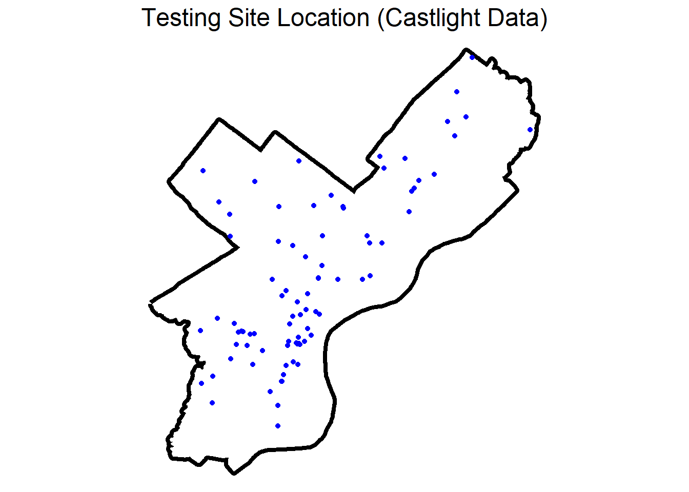
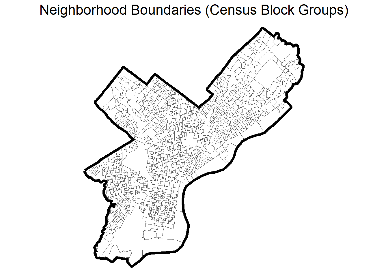
We used Philadelphia as an example to demonstrate how we calculated ‘Potential Community Demand’ (PCD). We used data provided by Castlight Health Inc. containing the location of testing sites as of January 2021. The locations of testing sites for the city of Philadelphia are represented by blue dots. We defined neighborhoods using the U.S. Census Bureau’s census block groups which was the smallest geographic unit for which data on neighborhood level indicators were available; the block group boundaries (gray lines) and the boundaries for Philadelphia (bolder black line) are shown in the map on the right.
Step 1: Distribution of the resident population to various testing sites: for each block group, we identified the 10 testing sites closest to the central point of the block group.
In order to distribute the resident population to the various testing sites across the city, we assumed that people were likely to attempt to go to sites that are nearby, so we focused on the 10 closest sites for every block group. We used population weighted census block group centroids from NHGIS.org (IPUMS) as the central points for each block group. We accounted for street networks when calculating distances from each block group to the testing sites in order to identify the 10 closest sites. To do that, we used the ArcGISPro 2.7.0 (ESRI, Redlands CA) Closest Facility tool to calculate street network distances between block group centroids and testing sites. Weights were calculated as inverse distance with a power value of 1:
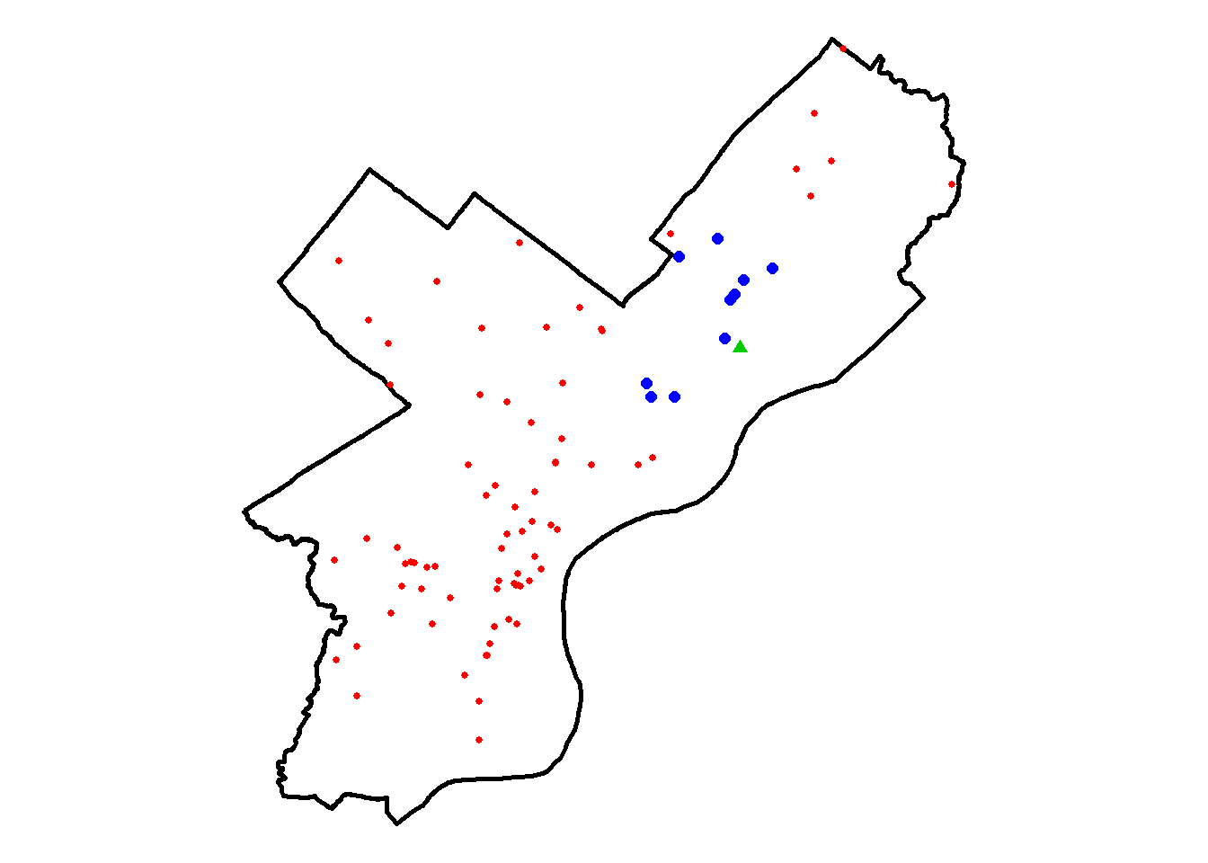
For example, the central point of an arbitrary block group (GEOID: 421010316002) is displayed as the green triangle, the 10 closest testing sites are shown as the blue dots and the other testing sites in Philadelphia are shown as the red dots.
Step 2: Potential Site Demand (PSD)
Distribution of population
We then took the population of each block group (obtained from the 2015-2019 ACS) and assigned each person to one of the ten closest testing sites. Because we assumed people would favor sites that are nearby, we divided the population proportionally based on the distance to the testing site.
For example, the central point of an arbitrary block group (GEOID: 421010316002) is displayed as the green circle. The width of the arrows represents how much of the population living in this block group is ‘allocated’ to the ten closest testing sites (blue dots). The closest site gets the bulk of the population (thick arrow) while the sites farther away get only a small fraction of the population (thin dotted lines).
For each testing site we have Potential Site Demand (PSD)
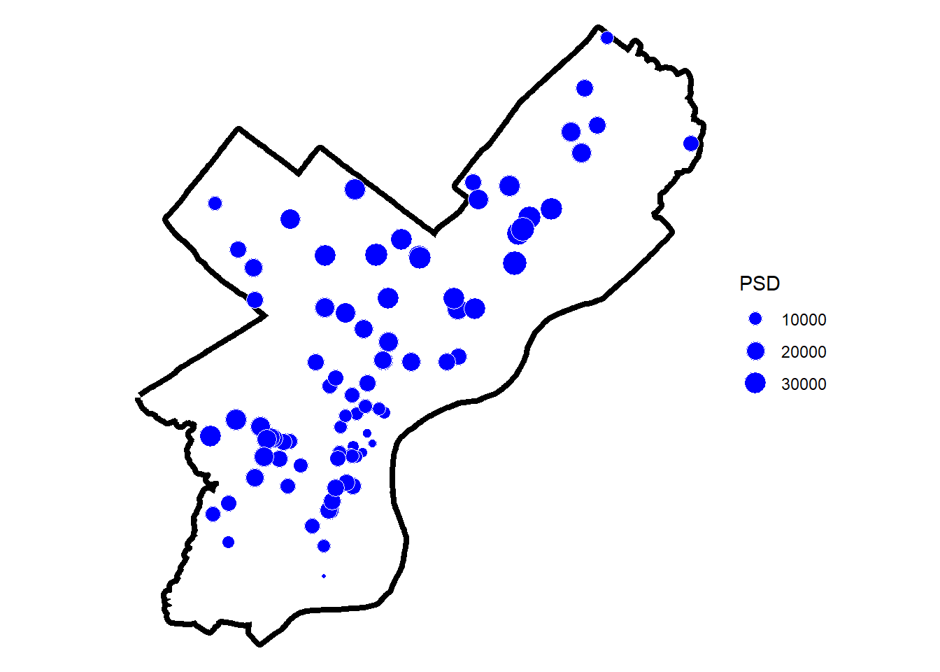
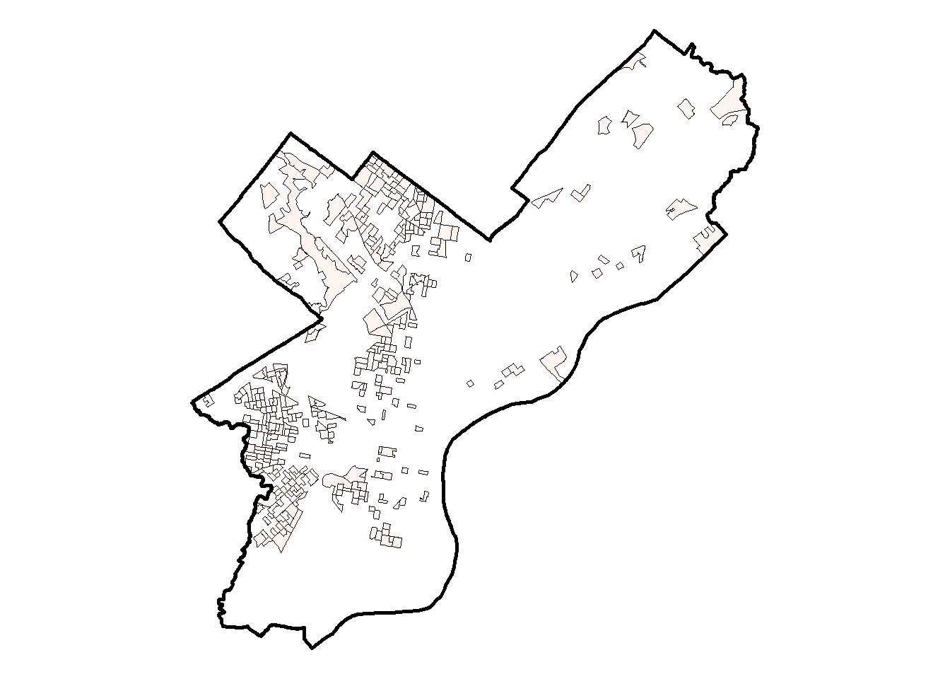
After redistributing the population of each block group to their respective ten closest testing sites as per the method described above, we can then calculate each site’s Potential Site Demand (PSD). The map to the left shows each testing site as a dot and the dot size represents PSD - how much of the population of Philadelphia is allocated to that site. Sites with higher PSD (population allocated) have a larger radius on the map and are expected to be busier than sites with lower PSD.
TAKEAWAY: The higher a testing site’s Potential Site Demand (PSD), the busier the testing site is expected to be.
Step 3: Potential Community Demand (PCD)
Ultimately, we aren’t so interested in comparing testing sites. Rather we are interested in comparing how spatial access to sites differs across neighborhoods. Therefore, for each neighborhood (block group) we calculate the Potential Community Demand (PCD) for testing by taking the average potential site demand (PSD) for the 10 nearest sites - this is done by calculating the weighted average of the site demand for the 10 closest sites using the inverse network distance from the site to the block groups as weights (i.e., closer sites get more weight).
Distribution of potential demand from testing sites to block groups
In other words, if the 10 closest sites to a block group were all equally far away, the PCD in the block group is a straight average of those 10 sites’ potential site demand. The closer a site is to the block group, the larger its weight in the average.
For example, the central point of an arbitrary block group is displayed as the green circle. The width of the arrows represents how the potential site demand (PSD) in the 10 closest testing sites (blue dots) is ‘weighted’ when calculating the block group’s average PCD. The closer a site is to the block group, the larger its weight in the average; this is represented as a thick arrow.
For each block group we now have Potential Community Demand (PCD)
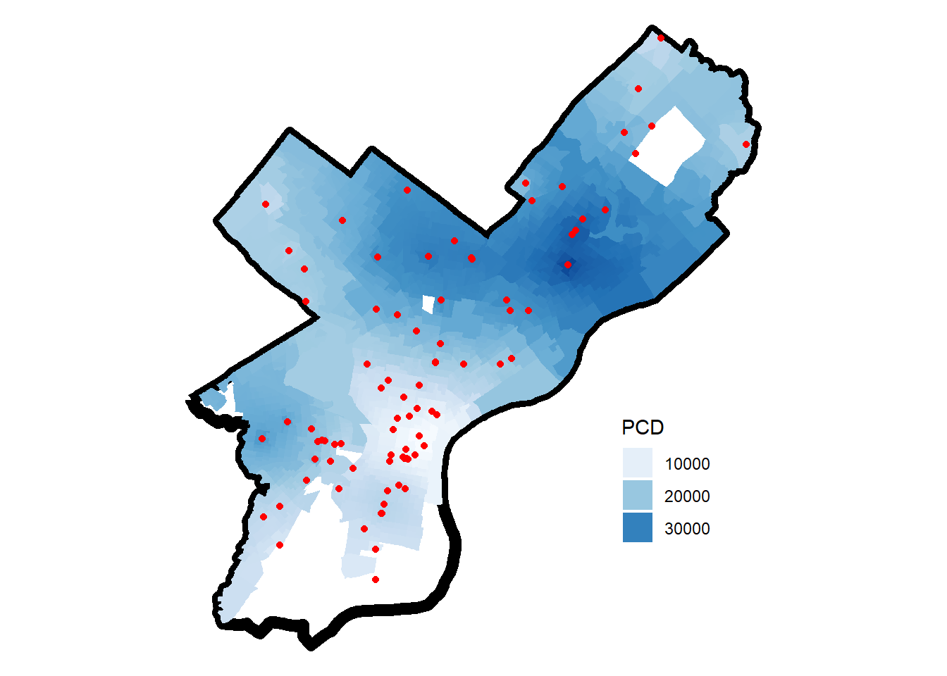
After repeating the calculation for PCD described above for all block groups, we now have a PCD score for each neighborhood. The map to the left displays the PCD. The PCD captures the potential demand for testing in the 10 sites closest to the BG and can be interpreted as reflecting how busy sites around a neighborhood are expected to be. Block groups with higher PCD are represented with a darker blue, while block groups with lower PCD have a lighter shade of blue.
TAKEAWAY: The higher a block group’s Potential Community Demand (PCD), the busier the testing sites serving that block group are likely to be because they are potentially serving a larger number of people.
Step 4: Calculate inequities
To see if there were disparities in PCD within a particular city we calculated the average PCD in neighborhoods at the top and bottom quartile of certain neighborhood level characteristics. The table below summarizes the steps we took to calculate these inequities.
| Step 4.1 | Categorize its block groups into four quartiles of a chosen neighborhood-level indicator. |
|---|---|
| Step 4.2 | For each quartile, we then calculate the average potential community demand for block groups in that quartile, weighted by block group population. |
| Step 4.3 | To quantify inequities, we compare average PCD in the top and bottom quartiles of an indicator. |
| Step 4.4 | Plot inequities. |
Below we will go through an example of how we examined the inequity in testing demand between neighborhoods with the highest % Hispanic compared to neighborhoods with the lowest % Hispanic.
Step 4.1: Categorize Neighborhoods by Quartiles of % Hispanic residents
Lowest % Hispanic
All neighborhoods
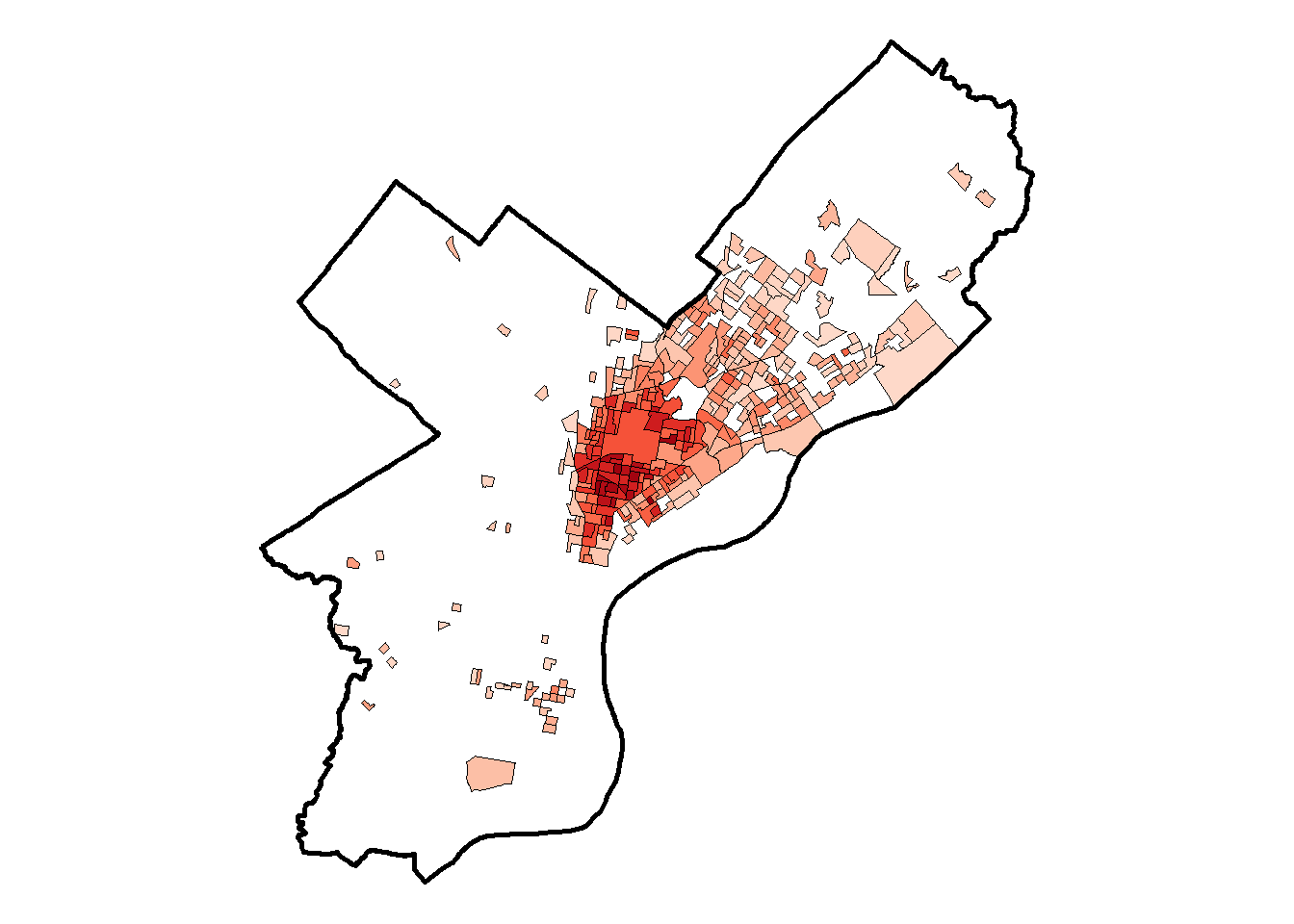
Highest % Hispanic
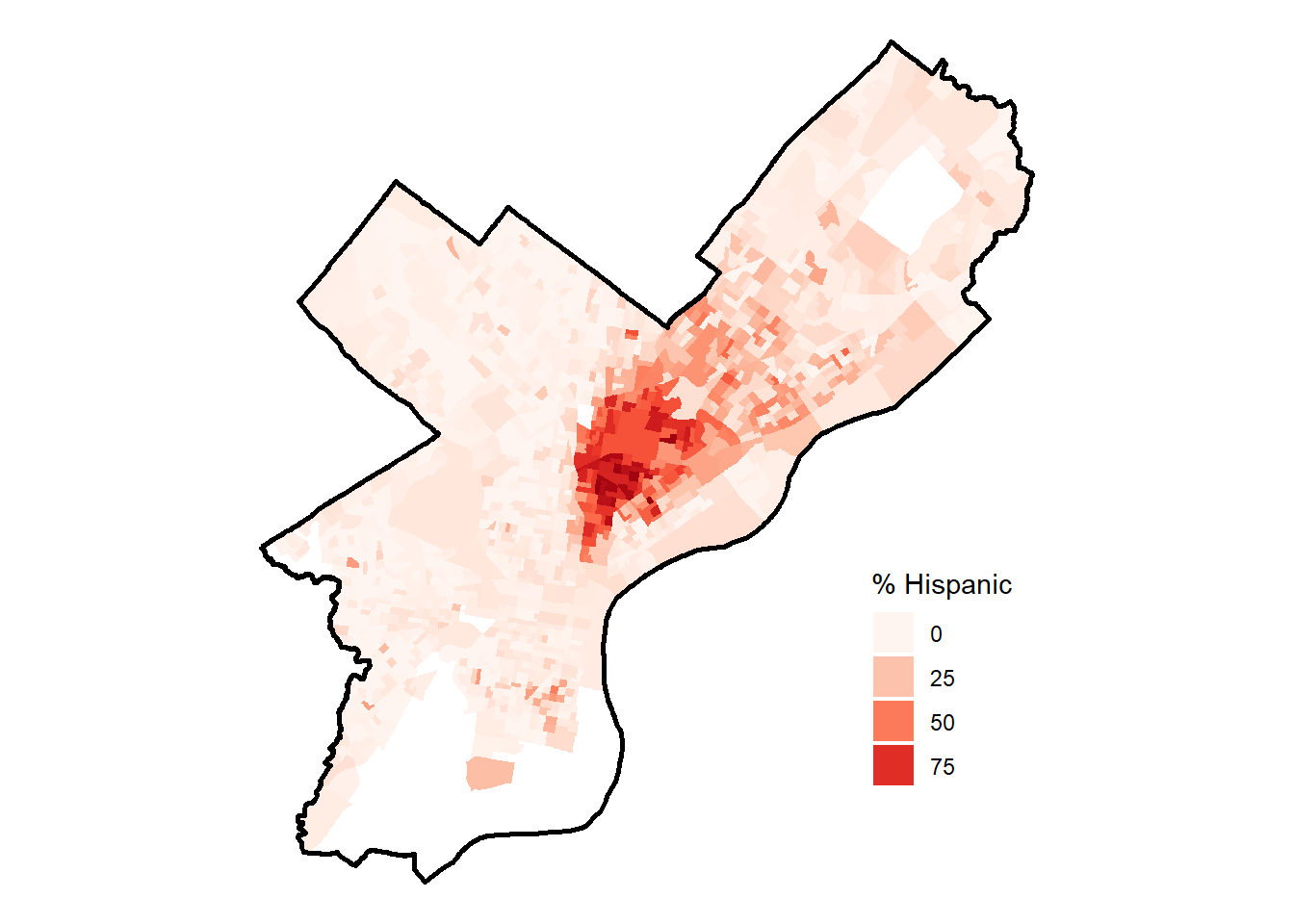
The map in the middle shows % of residents that are Hispanic for Philadelphia block groups. The block groups with lowest and highest % of Hispanic residents are shown on the left and right, respectively.
Step 4.2: Calculate Average Potential Community Demand (PCD) in each group
After grouping the block groups by lowest % Hispanic and highest % Hispanic we compute the average PCD, weighted by block group population. In Philadelphia, the block groups with the Lowest % Hispanic (<1.3%) have a population weighted average PCD of 22,067, and the block groups with the Highest % Hispanic (>16.9%) have a population weighted average PCD of 25,774. Remember, the higher the PCD, the busier the testing sites in that area are expected to be.
Step 4.3: Calculate Ratio of average Potential Community Demand (PCD) for highest vs lowest Quartiles
To compare the two groups, we can calculate a ratio with the formula:
This ratio (and the percent difference) tells us that block groups with the highest % of Hispanic residents (top quartile) have a 17% higher community demand, compared to block groups with the lowest % Hispanic residents (bottom quartile).
Step 4.4: Plot Inequities
We can plot the percent difference centered at zero in order to compare how demand of nearby testing sites differ between neighborhoods by various neighborhood level characteristics. The plot below displays inequities in PCD by several neighborhood-level indicators for the city of Philadelphia.
Areas with high values of these indicators (⬤) have more busy testing sites. Areas with high values of these indicators (⬤) have less busy testing sites.
References
1 Kim, S. R., Vann, M., & Bronner, L. (2020). Which cities have the biggest racial gaps in COVID-19 testing access? FiveThirtyEight. July 22, 2020.