By RAN LI, PRICILA MULLACHERY, STEVEN MELLY | April 28, 2021
Spatial accessibility to COVID-19 testing is an indicator of whether residents of a particular neighborhood have access to nearby COVID-19 testing. We used data provided by Castlight Health Inc. containing the location of testing sites in the 30 BCHC cities to construct two spatial accessibility measures:
- A walkshed-based measure: a neighborhood is defined as having high access if at least 25% of its area is within a 15 minute walk of a testing site.
- A 100-meter buffer based measure: a neighborhood is defined as having high access if any portion of it is within 100 meters of the site.
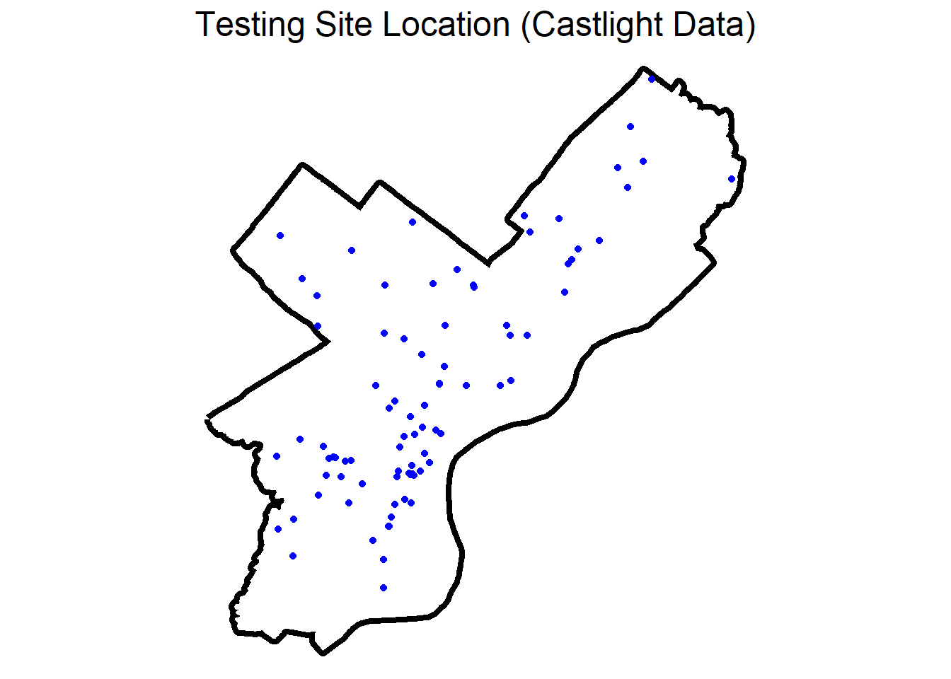
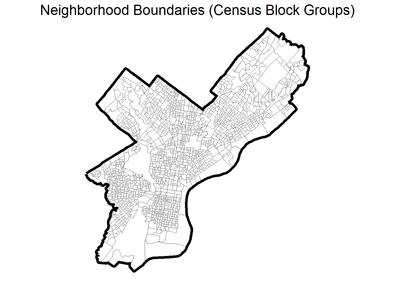
For this blog post, we will use Philadelphia as an example to demonstrate how these two definitions of spatial accessibility were implemented and to illustrate the results. The locations of testing sites for Philadelphia as of January 2021 are displayed on the map on the left as blue dots. We defined neighborhoods using the U.S. Census Bureau’s block groups; the block group boundaries (gray lines) for Philadelphia (bolder black line) are shown in the map on the right.
Spatial Accessibility Definitions
Walkshed-based measure (15-minute walking access to testing)
For each testing site we identified the area within a 15-minute walking distance (the walkshed); this process is displayed for a single arbitrary testing in the maps below. We used a national street network dataset (StreetMap Premium 2018, available with Business Analyst, ESRI, Redlands CA) to construct the walksheds. While this dataset has some information about barriers and pedestrian access, it does not include local details about barriers and access which will affect the accuracy of the walksheds. The map on the left shows the testing site as the blue dot, the 15-minute walkshed around this testing site is shown with a blue line, and the neighborhood boundaries (block groups) are shown with thin black lines. Using these walking areas, we can determine whether a neighborhood is within a 15-minute walk of a testing site. We identified any block group with greater than 25% of its area within a site walkshed as having high spatial access to testing. The map to the right shows “high spatial accessibility” neighborhoods shaded in dark gray.
Buffer-based measure (block group within a 100m radius of a testing site).
Another way we can categorize neighborhood access is to see if there is a testing site within a specific distance (e.g., 100 meters) of the neighborhood. To do this, we create a 100-meter buffer around a testing site (shown on the left) and then determine which block groups have any portion of their area within this buffer. Using this definition of spatial accessibility, the block groups that have high access to this site are filled with a darker shade as shown in the map on the right. Since block group boundaries are often major roads, and testing sites might be located on these same roads, this approach is useful for identifying neighborhoods across the street from a site.
Scale this to all neighborhoods
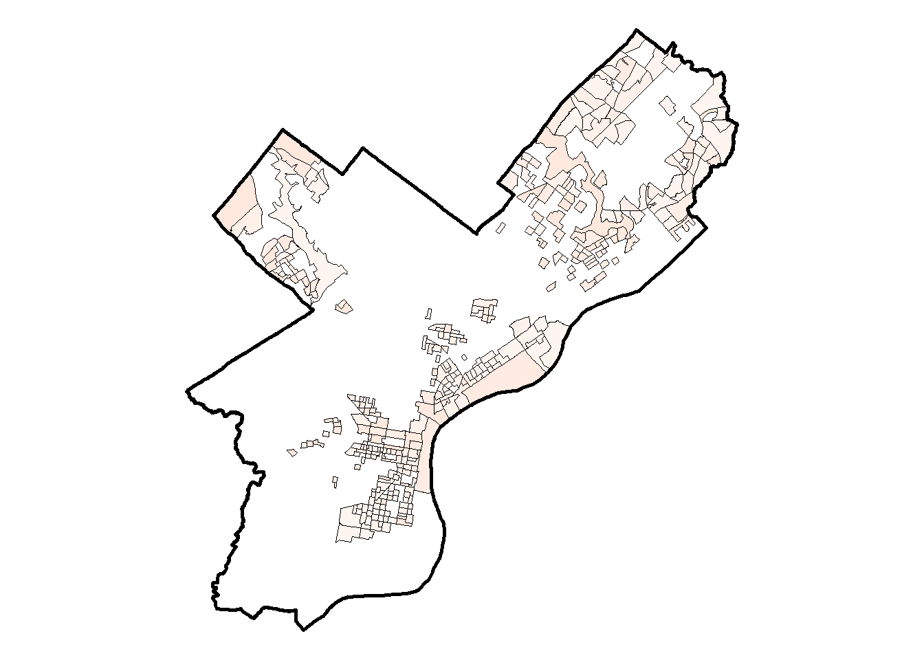
We can repeat the process described above for all testing sites and determine for all neighborhoods whether they have high spatial accessibility to testing or not. The maps below display the results of this for Philadelphia; in both maps testing sites are blue dots and shaded census block groups identify neighborhoods with high access to testing using the 15 minute walkshed based definition (left) and the 100 meter buffer based definition
Caclulating Inequities
To see if there were disparities in spatial accessibility within a particular city we calculated the % of population with high accessibility to testing at the top and bottom quartile of certain neighborhood level characteristics. The table below summarizes the steps we took to calculate these inequities.
| Step 4.1 | Categorize each city’s neighborhoods into four quartiles of a given neighborhood-level indicator. |
|---|---|
| Step 4.2 | For each quartile, we then calculate the % of the population with high accessibility to testing, weighted by block group population. |
| Step 4.3 | To quantify inequities, we compare % of the population with high spatial accessibility to testing in the top and bottom quartiles of an indicator. |
| Step 4.4 | Plot inequities. |
Below, we go through an example of how we examined the inequities in testing access between neighborhoods with the highest % non-Hispanic Black compared to neighborhoods with the lowest % non-Hispanic Black.
Step 4.1: Categorize Neighborhoods by Quartiles of % non-Hispanic Black residents
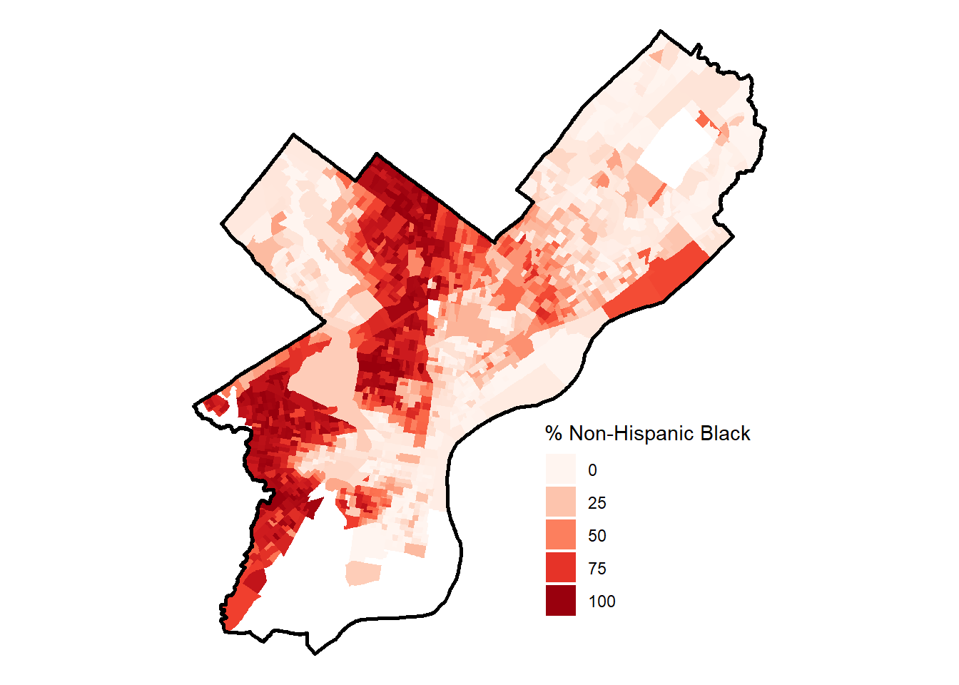
The map in the middle shows % of residents that are non-Hispanic Black for block groups of Philadelphia. The block groups with lowest and highest % of non-Hispanic Black residents are shown on the left and right, respectively.
Step 4.2: Categorize Neighborhoods by Quartiles of % non-Hispanic Black residents
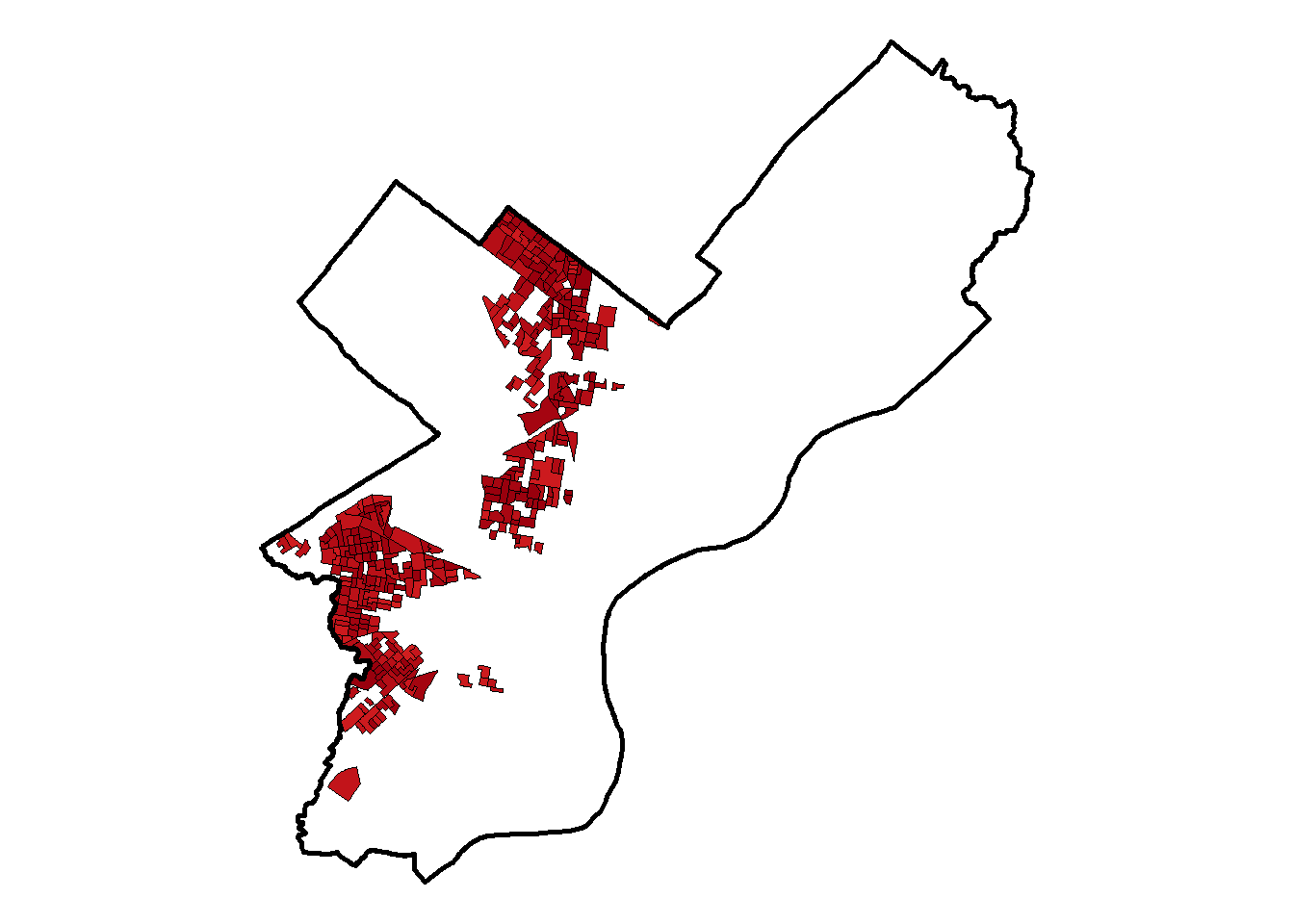
After grouping the block groups by lowest % non-Hispanic Black and highest % non-Hispanic Black we can compute which neighborhoods in these groups have high accessibility to testing. Below is a map of these neighborhoods grouped by % non-Hispanic Black categorized by whether there is a testing site within 100 meters of the block group.
Using these categorizations, we can calculate the % of the population in each of these groups that has high spatial accessibility to testing. In this case, in areas that have the lowest proportion of non-Hispanic Black residents 18.4% of the population lives within 100 meters of a testing site; on the other hand, in areas which have the highest proportion of non-Hispanic Black residents only 6.6% of the population lives within 100 meters of a testing site.
Step 4.3: Calculate difference in % with high access
One way to capture this inequity is to calculate the difference in % of population with high access between areas with the lowest proportion of non-Hispanic Black residents and areas with the highest proportion of non-Hispanic Black residents; in this case, the difference would be 11.8%. We can say that the absolute difference in the % of the population who has high access in neighborhoods in the top quartile of % Black compared to neighborhoods in the bottom quartile of % Black is 11.8%.
Step 4.4: Plot Inequities
Using the difference in % with high access metric described above we can compare how access to testing sites differ between neighborhoods group by various neighborhood level characteristics. The plot below displays inequities in testing site spatial accessibility by several neighborhood-level indicators for the city of Philadelphia. In this case, neighborhoods with a higher % of non-Hispanic Whites and people with completed college education have a much higher spatial accessibility to testing sites, while neighborhoods with a higher % of non-Hispanic Black residents have a much lower spatial accessibility to testing sites.