By Asma Sharaf | January 11, 2022
The COVID-19 Health Inequities in Cities Dashboard, which tracks inequities in COVID-19 outcomes by various population subgroups and across multiple geographic levels, has recently launched an update that features supplemental data on hospitalization metrics. This new data was obtained from the U.S. Department of Health & Human Services (HHS). This data is supplemented by other sources including local and state health departments and the Centers for Disease Control and Prevention (CDC).
This newest addition to the dashboard allows users to compare hospitalization counts, rates, and occupancy for all Big Cities Health Coalition (BCHC) cities and examine hospitalization data across cities by various city attributes. Additionally, users can examine inequities in COVID-19 hospitalization by race/ethnicity and select city-level indicators, such as those related to demographics, wealth/poverty, occupation, segregation, vulnerability, and housing.
Comparing COVID-19 Hospitalization Rates across BCHC Cities
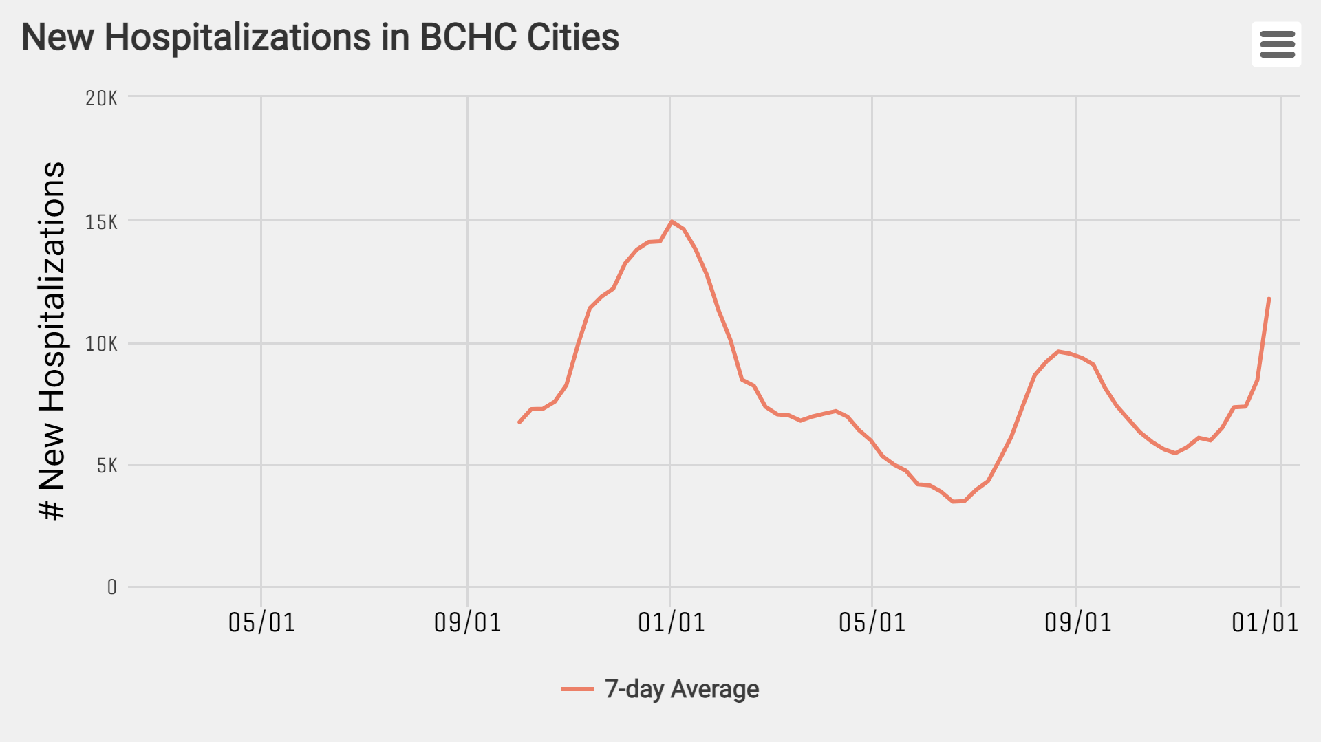
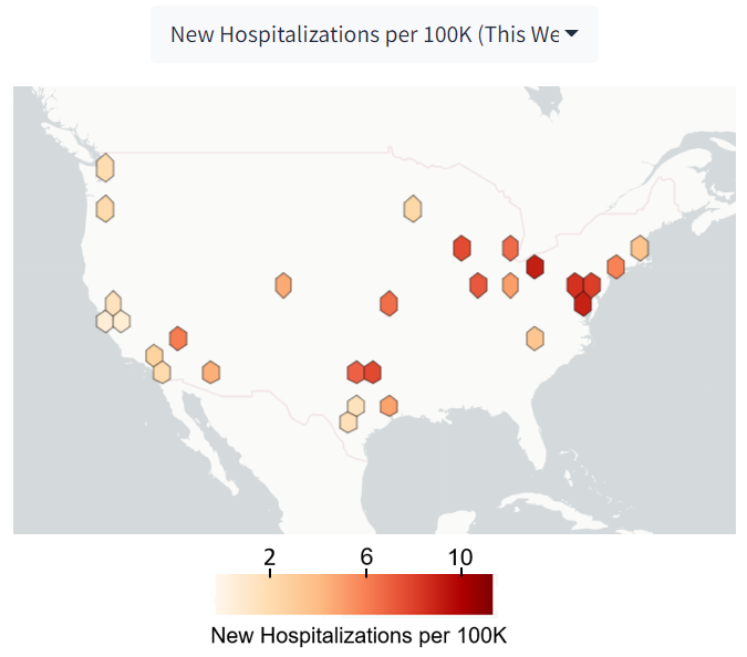
In the “Compare Across Cities > City Levels and Trends” section of the dashboard, users can examine trends in weekly new hospitalizations across cities (Figure 1) and view an interactive map of BCHC cities (Figure 2) that displays various hospitalization outcomes. Notice that for the hospitalization outcomes trends don’t begin until October 2nd, 2020, when HHS started having reliable data on hospitalization metrics. Figure 1 shows an increase in hospitalization rates beginning on the week of October 29th, a month before the omicron variant was first detected.
Fig 1. The 7-day average of new hospitalizations across all BCHC cities over time from 10/02/20 - 12/24/21.
The map in Figure 2 features several new hospitalization outcomes including weekly new hospitalizations per 100K the percent change in new hospitalizations per 100K (2 week & 4 week), the percent of COVID-19 among hospital beds (ICU & inpatient), and the percent change in COVID-19 among hospital beds (ICU & inpatient). In Figure 2, we see that Cleveland, OH has the highest daily average hospitalization rate (10.3%) for the week of 01/03/2022 followed by Washington, DC., Baltimore, MD and Philadelphia, PA, with daily average hospitalization rates ranging from 9.2 to 10.3 per 100,000.
Fig 2. The 7-day average of new hospitalizations across all BCHC cities over time from 10/02/20 - 12/24/21.
In the same section, users can scroll to a panel titled “Weekly Hospitalization Metrics by City” to compare hospitalizations metrics across BCHC cities over time by metric type and age group. The hospitalization outcomes featured in this map include hospitalization counts/rates, as well as outcomes related to occupancy such as % ICU beds occupied by COVID-19 patients and % Inpatient Beds occupied by COVID-19 patients.
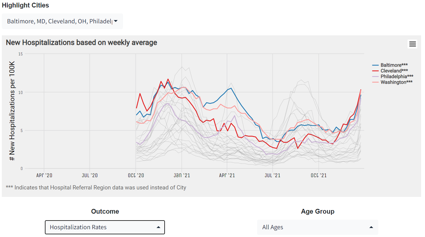
This panel allows users to select; a city of interest from the dropdown menu, a hospitalization outcome of interest, and an age group (All Ages, 0-17, or 18+) to view hospitalization trends over time.
In Figure 3, you can see the hospitalization rate trend for select cities (i.e., Washington, DC, Cleveland, OH, Philadelphia, PA & Baltimore, MD). Notice the most recent dates in the trends display a positive slope upwards indicating that hospitalizations rates in those cities are steadily rising, similar to the trend observed in Figure 1 and Figure 2.
Fig 3. Rates of New Hospitalizations in Select Cities from 10/02/20 - 12/24/21.
Inequities in COVID-19 Hospitalization
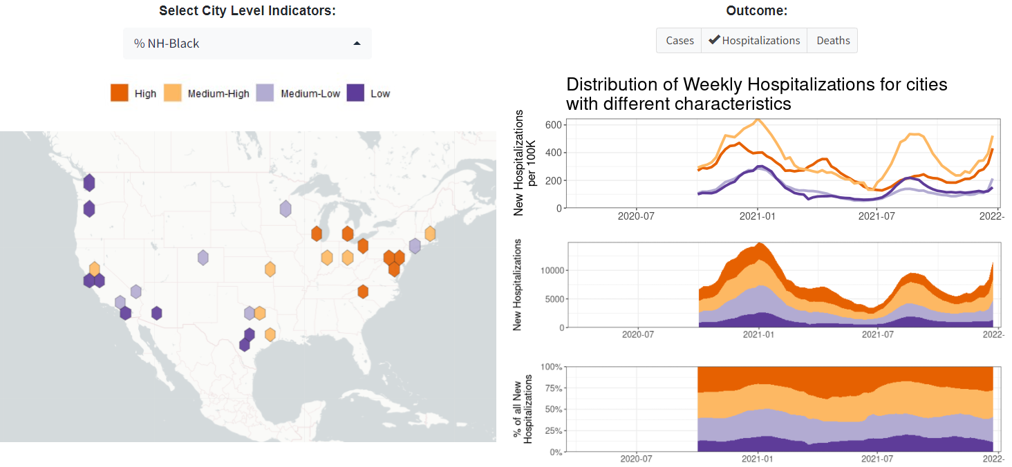
Inequities in hospitalization outcomes exist among various population subgroups and at different geographic levels. In the “Daily/Weekly Counts and Rates by City Attributes” panel, users can select a desired city level indicator. There are several broad categories of indicators including demographic, (e.g., population density, % NH-Black, % Foreign-born), socioeconomic (e.g., % poverty, GINI) and social (e.g., segregation indices). Once an indicator is selected, users can interact with a map of the selected attribute, as well as plots showing hospitalization rate trends by the selected attribute across BCHC cities over time.
In Figure 4, we observe that cities with higher % NH-Black residents (including Cleveland, OH, Baltimore, MD, & Washington DC) have higher hospitalization rates per 100K and higher new hospitalizations counts, which collectively accounts for a greater % of cities experiencing new hospitalizations compared to cities with a lower % NH-Black residents.
Fig 4. Daily/Weekly Hospitalization Counts and Rates by Select City Attributes across BCHC Cities.
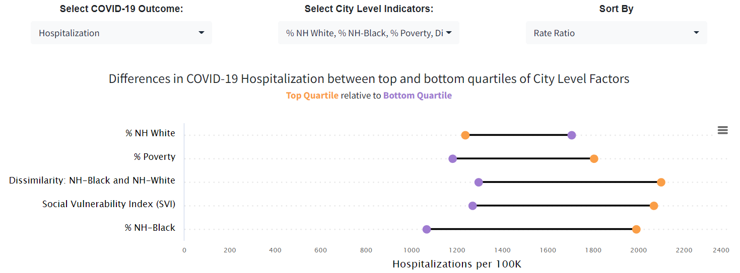
To view inequities in hospitalizations by various city level indicators, users can navigate to the “Compare Across Cities> Inequities>Outcomes>City Level” section of the dashboard. Here, the panel entitled “Inequities in COVID-19 Outcomes by City Factors” allows users to select an outcome of interest (including hospitalizations) and examine differences in the selected outcome by various city level factors including several demographic (e.g., population density, % NH-Black) and socioeconomic factors (e.g., % poverty, social vulnerability index).
In Figure 5, we observe higher rates of COVID-19 hospitalizations among cities in the top quartile (top 25%) of % poverty, residential segregation between NH-Black and NH-White residents, social vulnerability and % NH-Black residents, relative to cities in the bottom quartile (bottom 25%). More specifically, we see that in cities in the top quartile of % NH-Black residents, the rate of COVID-19 hospitalization is 87% higher than in cities in the bottom quartile.
Fig 5. Inequities in COVID-19 Hospitalization by Select City Factors.
Given the ongoing nature of the COVID-19 pandemic, it is pertinent to continue monitoring and characterizing hospitalization rates across the U.S. to determine the scope and impact of the pandemic, especially considering the newly reported Omicron variant.